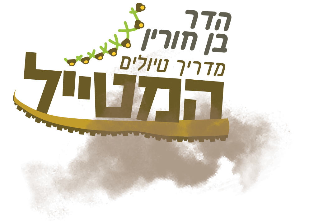
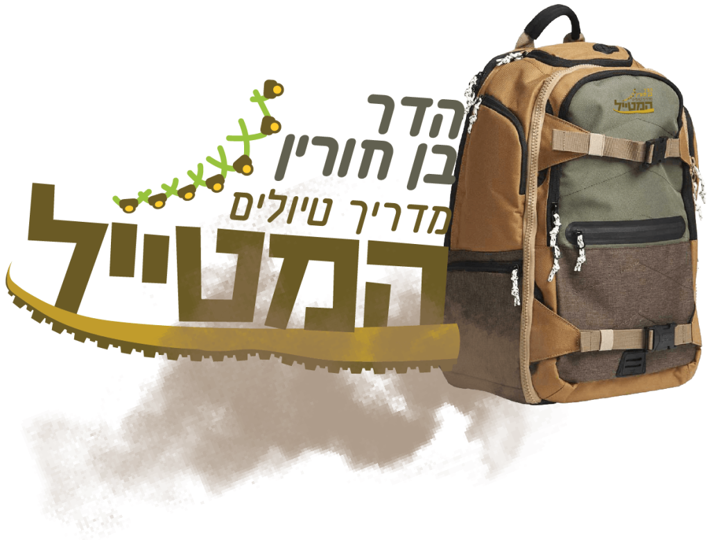
Branding and campaign for the travel guide company Characterization and design of an image system for the traveler company in the process
This project was important to market the company to the Israeli target audience to create a connection that would characterize trips in Israel and hence the choice of the company's name the traveler the font is heavy how does it convey an Israeli sense of balance if this is there is a play on letters something that creates a shift and connects to the concept of the logo that creates the shape of a shoe and thus there is a connection between the name of the company For the logo, the colors of the company's image are shades of brown, yellow, and green, so that the colors are earth and nature colors that relate to the company's theme
My part in the design and execution branding campaign
At the beginning of this project process, it was very challenging to design a logo and an image for the company that would convey the concept that this is a company that is connected to the main theme of traveling in Israel. The logo is designed in the form of a shoe. Green is something that links to nature and trips