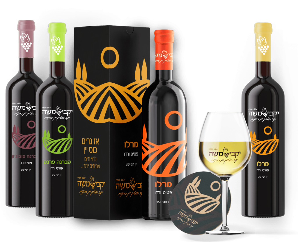
Characterization and design of the Moshe wineries image system In the process of this project, it was important to create a feeling of a winery that conveys Israeliness and religiosity because this winery is a religious wine winery, so the feeling was to give a biblical and ancient look but luxurious and clean. The chosen font of the logo conveys the need for a biblical font. The colors of the logo were chosen in reminiscent colors Wine and winery purple red burgundy colors that connect to the world of wine green and earthy orange that give a feeling of soil and growth of the winery.
My part in the design and execution branding campaign
Building branding and graphic language for Yakvi Moshe Yes, a large and particularly memorable advertising campaign during which there were design challenges, choosing the images and processing them, burning retouching until a desired result was obtained, during this campaign I participated in making design decisions and building the branding of the campaign and the brand at the beginning of the project process. This project was very challenging to design for the company A logo and image that will convey the perception that this is a Tanakhi Wine Cohanim winery. In addition to this process, it was important to maintain a feeling of a prestigious and good winery that would also speak to the entire target audience and not just to a specific target audience.
The campaign included deployment in wide media on billboards, radio and internet.
In addition to this, I follow the company's print/digital web design setup.